Use Vue to Render Charts Dynamically
This is the third of the three-part series on JavaScript. In the first post 'Google Charts for Graphs', we talked about using the Google Charts JavaScript library to render client-side charts directly in the browser. In the second post 'Vue Javascript Library First Step', we talked about using Vue.js to leverage Vue's features. In this post, we will combine the two as well as introduce new Vue JavaScript special HTML attributes that start with 'v-' called directives. Must like what we saw in the second post with 'v-on', these Vue directives are one of the most important elements that allow the interactively on the HTML page.
Final Example Code
As with the last post, I am going to post the final code first with the explanation to follow.
This is the code:
<!DOCTYPE html>
<html lang="en">

<head>
 <meta charset="UTF-8">
 <meta name="viewport" content="width=device-width,initial-scale=1.0">
 <title>Hello Vue!</title>
 <script type="text/javascript" src="https://www.gstatic.com/charts/loader.js"></script>
 <script type="text/javascript">
 google.charts.load('current', { 'packages': ['corechart'] });
 google.charts.setOnLoadCallback(drawChart);

 function drawChart() {

 var data = google.visualization.arrayToDataTable([
 ['Protocol', 'Value'],
 ['TCP', 15],
 ['UDP', 30],
 ['ICMP', 45],
 ['Others', 10],
 ]);

 var options = {
 title: 'Network Protocols',
 pieStartAngle: 180,
 width: 900,
 height: 500,
 pieSliceText: 'label',
 slices: {
 1: { offset: 0.1 },
},
};
var chart = new google.visualization.PieChart(document.getElementById('piechart'));
chart.draw(data, options);
}
</script>
<script type="text/javascript">
google.charts.load("current", { packages: ["corechart"] });
google.charts.setOnLoadCallback(drawChart);
function drawChart() {
var data = google.visualization.arrayToDataTable([
["Protocol", "Value", { role: "style" }],
["TCP", 15, "#b87333"],
["UDP", 30, "silver"],
["ICMP", 45, "gold"],
["Others", 10, "color: #e5e4e2"]
]);
var view = new google.visualization.DataView(data);
view.setColumns([0, 1,
{
calc: "stringify",
sourceColumn: 1,
type: "string",
role: "annotation"
},
2]);
var options = {
title: "Network Protocols",
width: 600,
height: 400,
bar: { groupWidth: "95%" },
legend: { position: "none" },
};
var chart = new google.visualization.BarChart(document.getElementById("barchart"));
chart.draw(view, options);
}
</script>
</head>

<body>

 <div id="app">
 <h2>[[ title ]]</h2>
 <button type="button" v-on:click="setPieChart">Pie Chart!</button>
 <button type="button" v-on:click="setBarChart">Bar Chart!</button>
 <button type="button" v-on:click="clearCharts">Clear</button>
 <div id="piechart" style="display:none"></div>
 <div id="barchart" style="display:none"></div>
 </div>
 <script src="https://cdn.jsdelivr.net/npm/vue/dist/vue.js"></script>
 <!-- Vue Script -->
 <script>
 var app = new Vue({
 delimiters: ['[[', ']]'],
 el: '#app',
 data: {
 title: 'Choose Your Chart',
 },
 methods: {
 setPieChart: function () {
 document.getElementById('piechart').style = "width: 900px; height: 500px;";
 document.getElementById('barchart').style.display = "none"
 },
 setBarChart: function () {
 document.getElementById('barchart').style = "width: 900px; height: 300px; ";
 document.getElementById('piechart').style.display = "none";
 },
 clearCharts: function () {
 document.getElementById('piechart').style.display = "none";
 document.getElementById('barchart').style.display = "none";
 },
 },
 });
 </script>
</body>
</html>
Wow, that is a lot of code and look a bit scary, but if we break it down by sections, it is not too bad.
Breaking Down by Sections
To begin, we know the whole page is enclosed in the <html></html> tags consist with two sub-sections of <head></head> and <body></body>. If we look closer, in the head section, the first <script></script> section just loads the Google Charts library via CDN, which we have seen before. The following two <script></script> sections consist of almost identical Google charts code, which renders either a Pie or a Bar chart with some data, so far nothing is new.
In the body section, we have three sub-sections of <div id="app"></div>, <script src=""..></script>, and <script></script>. The second part just loads the Vue JS library, so we don't need to spend too much time on it. In the first <div> section, we have three buttons and two positional div that corresponds to where we should display the graph. Each of the buttons has the v-on:click="..." attribute with some names. When we read the documentation, we know the 'v-on' listens to some DOM event, in this case, a mouse click. The name corresponds to the names of the method in the Vue script section. They also have this style of style="display:none" that prevents from showing up when loaded.
In the functions, we use the document.getElementById('<id>') JavaScript code to identify the section we want to modify, and set the style of width and height. Notice that we alternate the display variable, in the case of 'setPieChart' function, we set the pie chart style to something while the bar chart to none, and vice versa for the bar chart.
Let's look at the final result.
Final Result
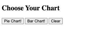
When you load the page, this is no frill page:

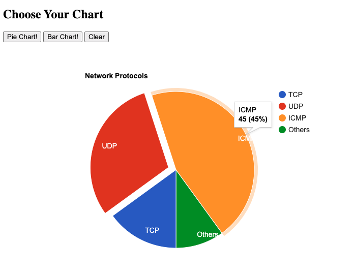
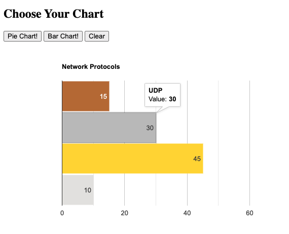
But hay, when you click on each button, the charts will either display or hidden. We can also clear both charts.

Here is the bar chart:

I hope to write more about HTML, CSS, and Vue JavaScript in the future. Leave me comments if you'd like to know more about a particular piece within them.
Happy Coding!
Eric